AKUA Secure Logistics is a cutting-edge technology company that enhances the security and transparency of global supply chains. By combining cybersecurity expertise with advanced IoT tracking, AKUA provides real-time location, temperature, and humidity monitoring for shipments, ensuring cargo safety and compliance throughout transit.
Designed for industries handling high-value or sensitive goods, AKUA’s solutions help businesses mitigate risk, prevent theft, and maintain shipment integrity. Its user-friendly platform delivers actionable insights, allowing logistics managers to make informed decisions and optimize supply chain efficiency. With AKUA, companies can trust that their shipments are secure, monitored, and protected every step of the way.
Brief
AKUA Secure Logistics, a cybersecurity spin-off entering the logistics space, required a brand identity that would differentiate it from competitors while maintaining trust and credibility. The goal was to create a visual and messaging framework that emphasized innovation, security, and real-time shipment monitoring, helping the company carve out a unique position in the market.
Objective
To analyze how Akua Inc. strategically positions itself through branding to stand out among competitors while maintaining credibility and trust in the security and logistics industry.
Brand Identity
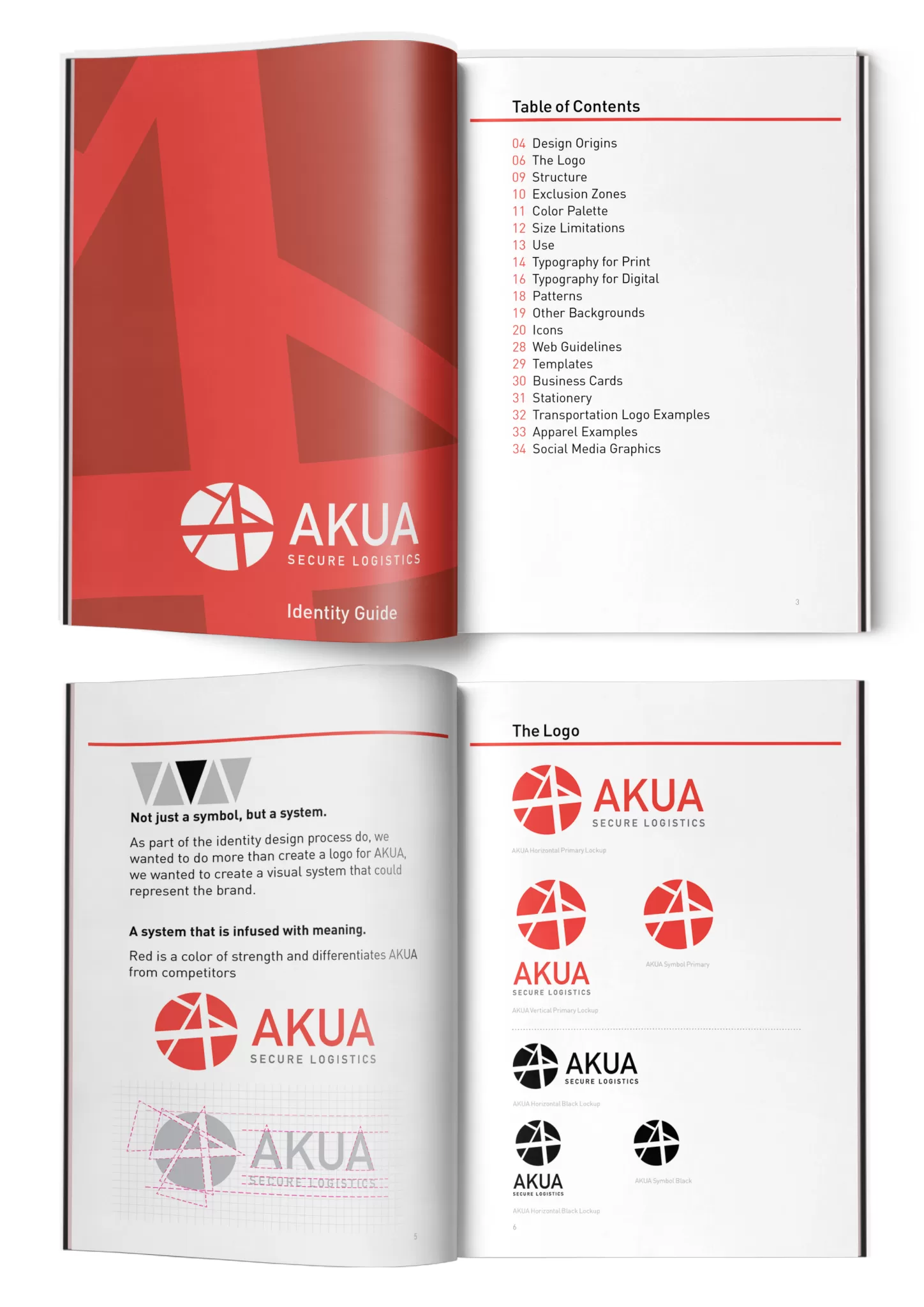
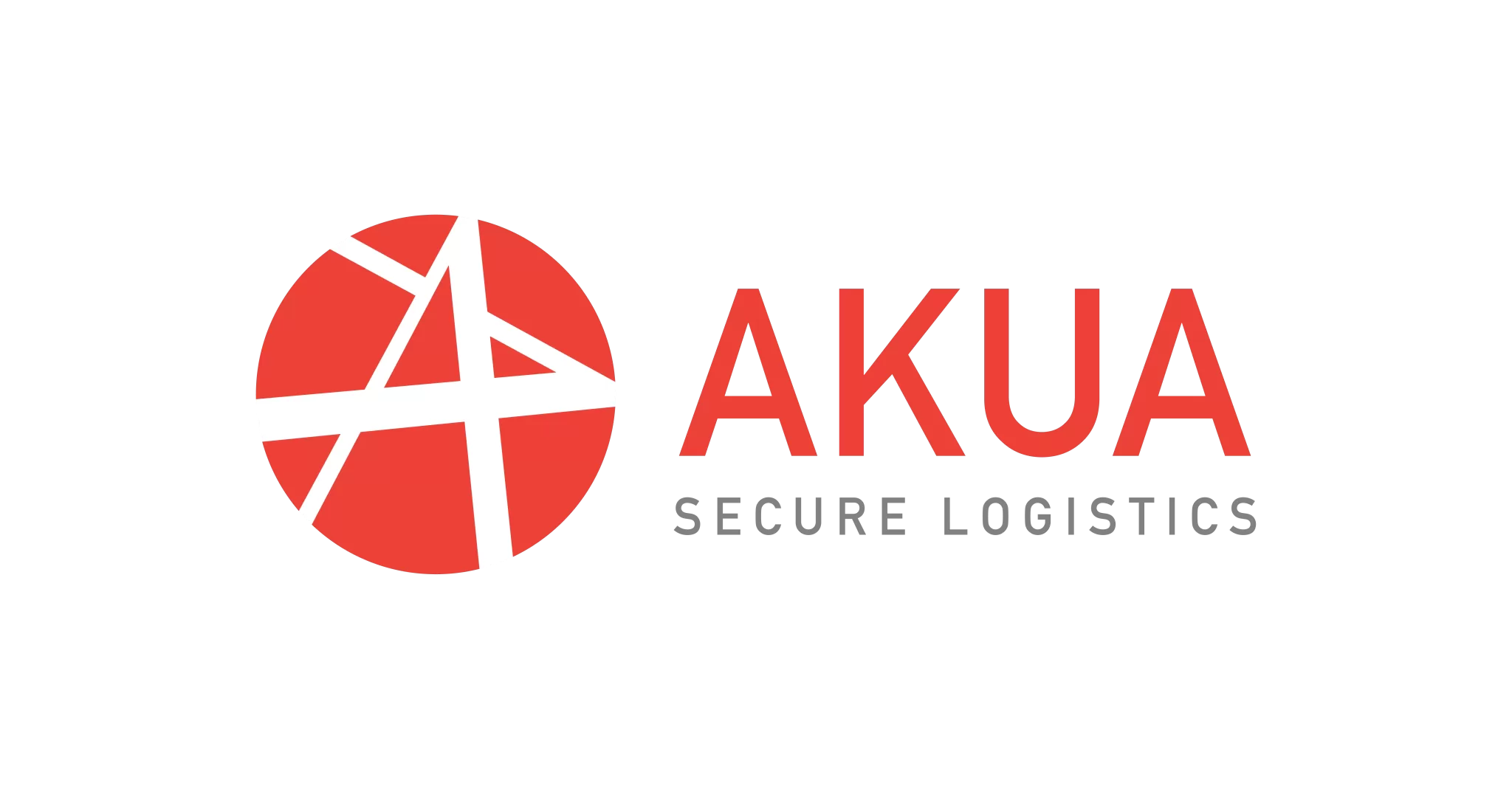
- The name “Akua” is Polynesian for “god,” but the client did not want any religious associations. Instead, we leaned into Polynesian visual elements to create a meaningful brand identity.
- Red, in Polynesian culture, symbolizes life force, vitality, courage, strength, and spiritual protection.
- The triangle, representing a shark tooth, signifies power, leadership, and strength—key traits for a security-focused brand.
- The varying weight of the lines in the logo represents movement, tying the design to intermodal transportation security.
Typography
- We paired the logo with the DIN typeface, originally designed for traffic signs, license plates, and road signs.
- This choice subtly reinforces the theme of intermodal transportation security while maintaining a clean and professional aesthetic.
Color
- The red color palette reinforces strength and security while maintaining a distinct and recognizable brand presence.
- Unlike competitors that primarily use blue and gray tones to convey security and technology, Akua’s bold red color sets it apart, making it unique and instantly recognizable in the marketplace.
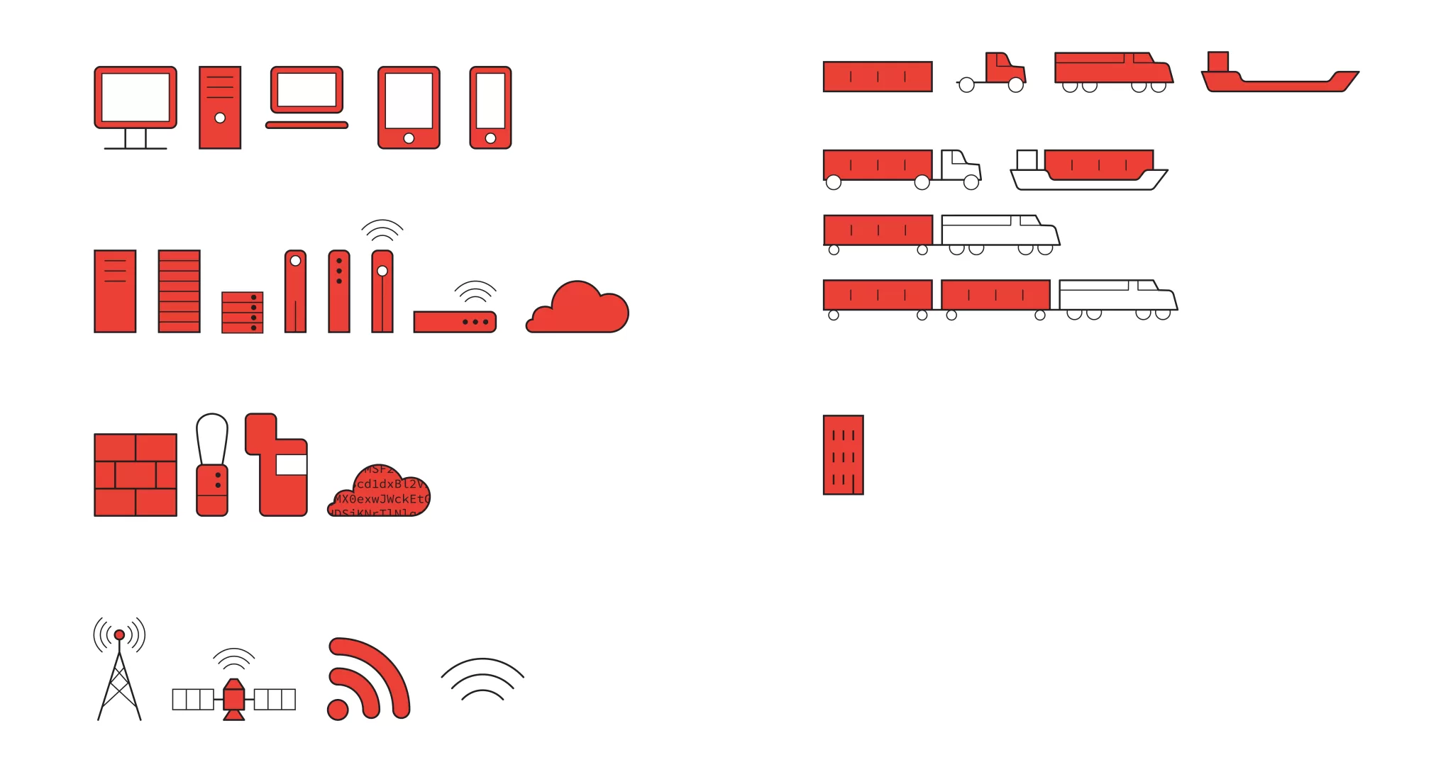
- Designed custom icons and graphics illustrating real-time tracking, security, and logistics in an intuitive manner.
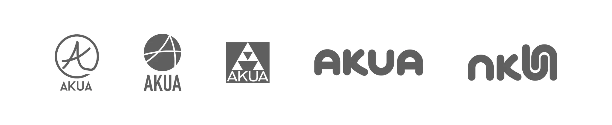
Concepts
Deliverables
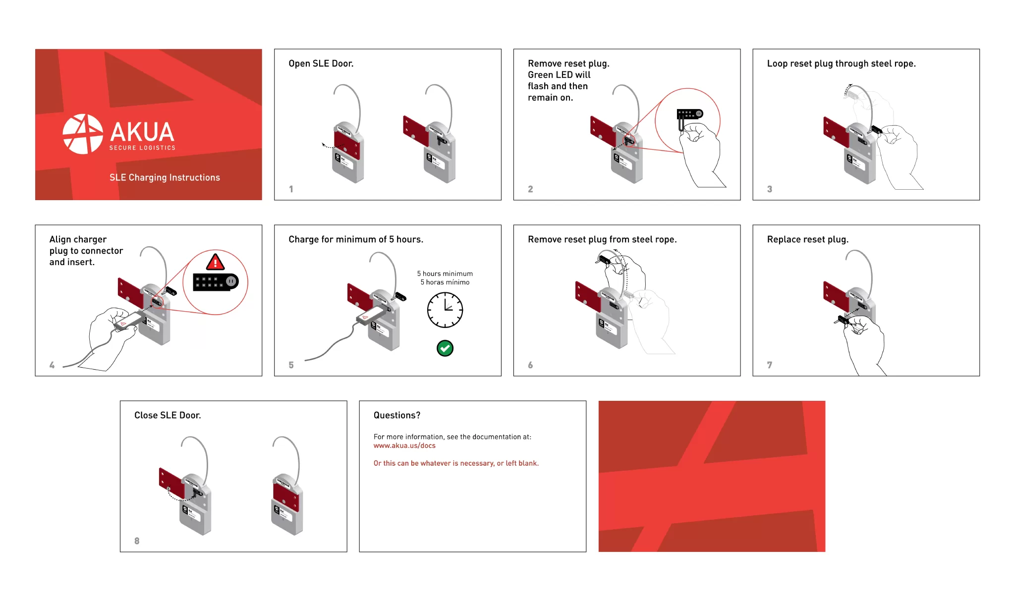
The deliverables for Akua’s branding project encompassed a comprehensive suite of visual assets to establish a cohesive and professional identity. This included a logo that encapsulated the brand’s strength and innovation, along with a style guide to ensure consistency in typography, color usage, and visual elements across all materials. Additionally, we designed business cards and envelopes, reinforcing brand recognition in professional communications. For product presentation, we developed product labels and instructional materials to enhance user experience and brand credibility. To support sales and marketing efforts, we created product marketing sheets that clearly communicated key features and benefits, as well as overall marketing materials such as brochures and digital assets. To strengthen Akua’s digital presence, we also developed a social graphic package, including templates and branded visuals optimized for various platforms, ensuring a consistent and engaging online identity across social media channels.